Home office colors influence focus more than most people expect when planning a workspace. The right home office colors can calm a racing mind or accidentally amplify the same distractions they were meant to reduce.
These recommendations draw on how color affects mood and attention, adapted specifically for a room where sustained focus matters most of the day.
1. Soft Blues for Calm Concentration
Muted blue tones are consistently linked to lower stress and steadier focus, making them one of the most reliable home office colors for long work sessions.
2. Sage or Muted Green for Balance
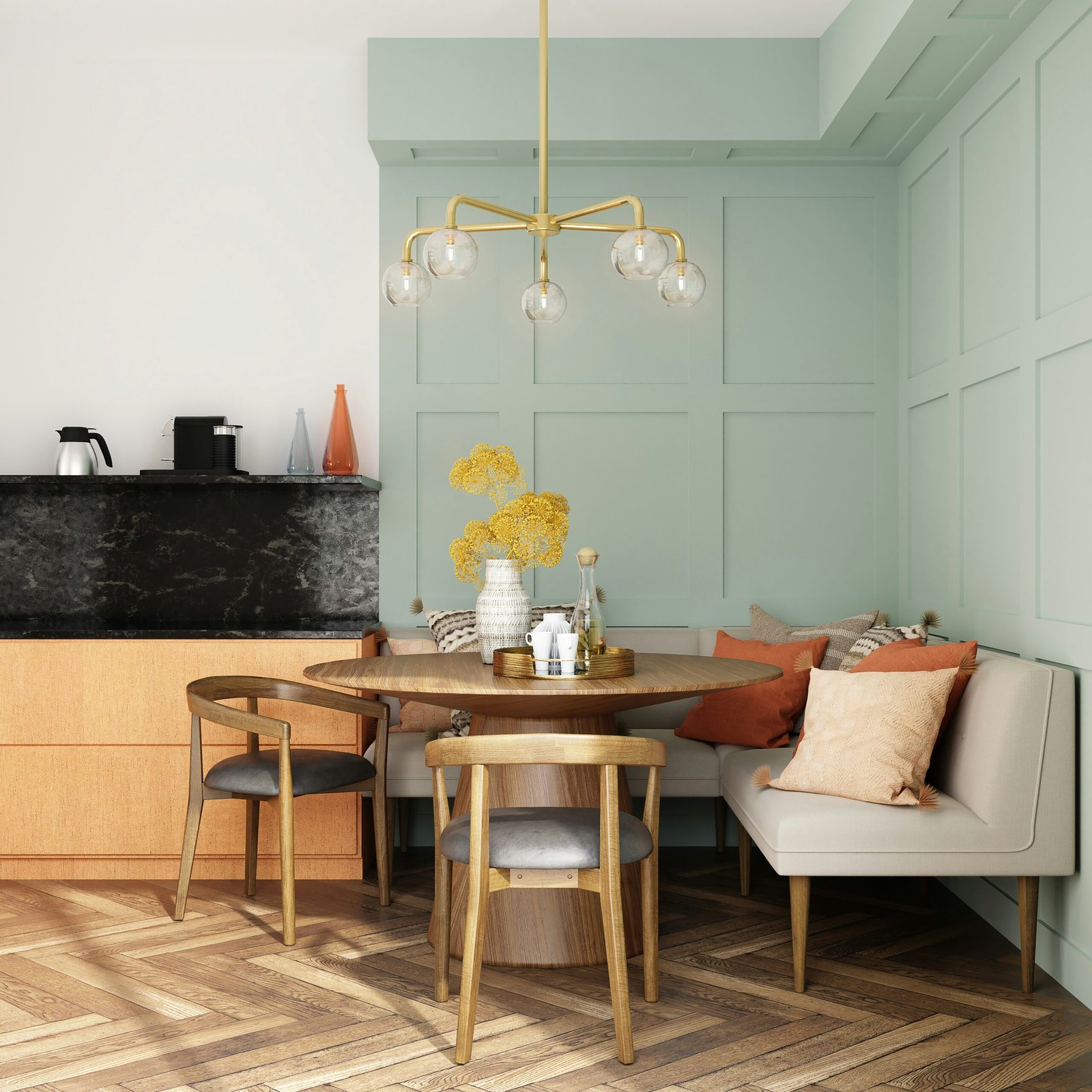
Green connects to nature and tends to reduce eye fatigue during screen-heavy days, offering a restful backdrop without feeling flat or sterile.
3. Warm Neutrals to Avoid Sterility
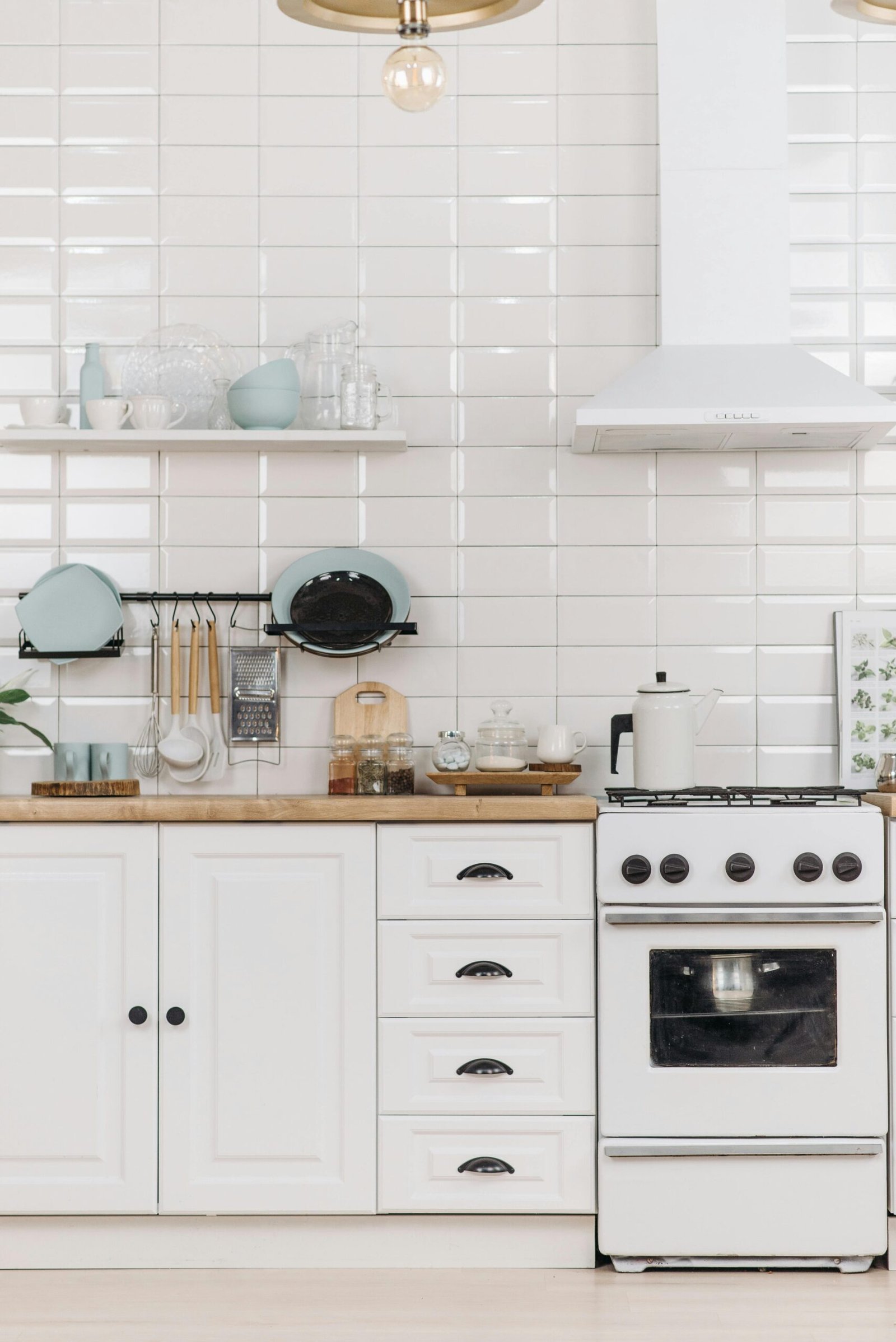
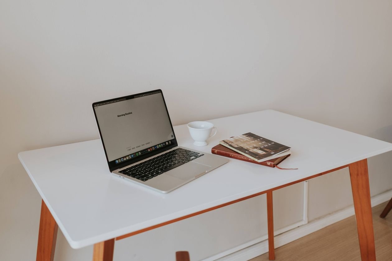
A pure white office can feel clinical over time. Warmer neutrals like soft greige keep the room feeling grounded rather than blank.
4. One Energizing Accent Wall
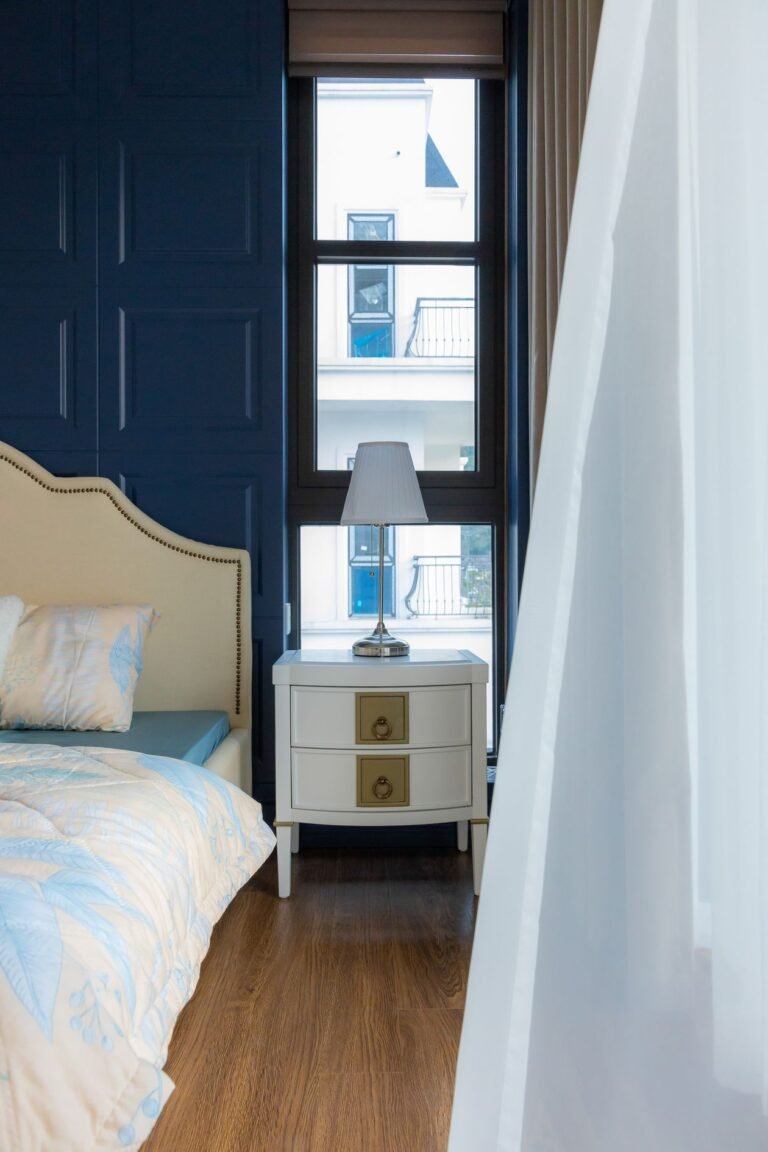
A single wall in a deeper tone, like a muted terracotta or navy, adds visual interest without overwhelming the calming effect of the room’s home office colors overall.
5. Skip Bright Red and Orange as Primary Colors
These tones raise alertness but also raise stress and heart rate over long exposure, making them poor choices as the dominant color in a focus-driven room.
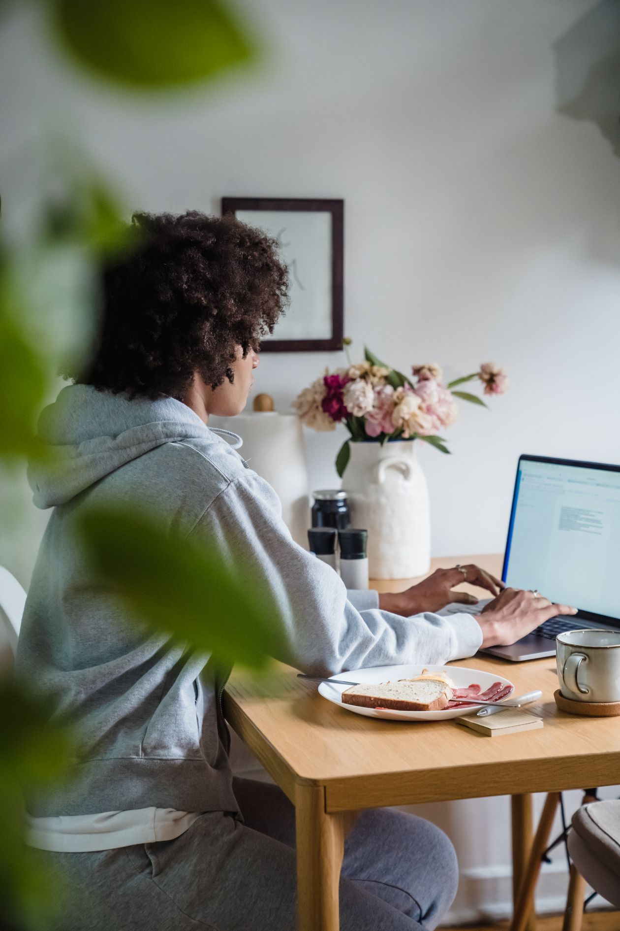
How to Choose Home Office Colors for a Small Room
Lighter shades within the same calming palette keep a small room from feeling closed in, while still supporting the same focus benefits as a larger space.
Mistakes to Avoid
Skip painting every wall in a bold, saturated color. Reserve intensity for a single accent wall rather than surrounding yourself with stimulation on all sides.
A Simple Test Before You Commit to a Paint Color
Paint a large swatch and observe it at different times of day before committing, since lighting shifts can change how a color actually reads while working.
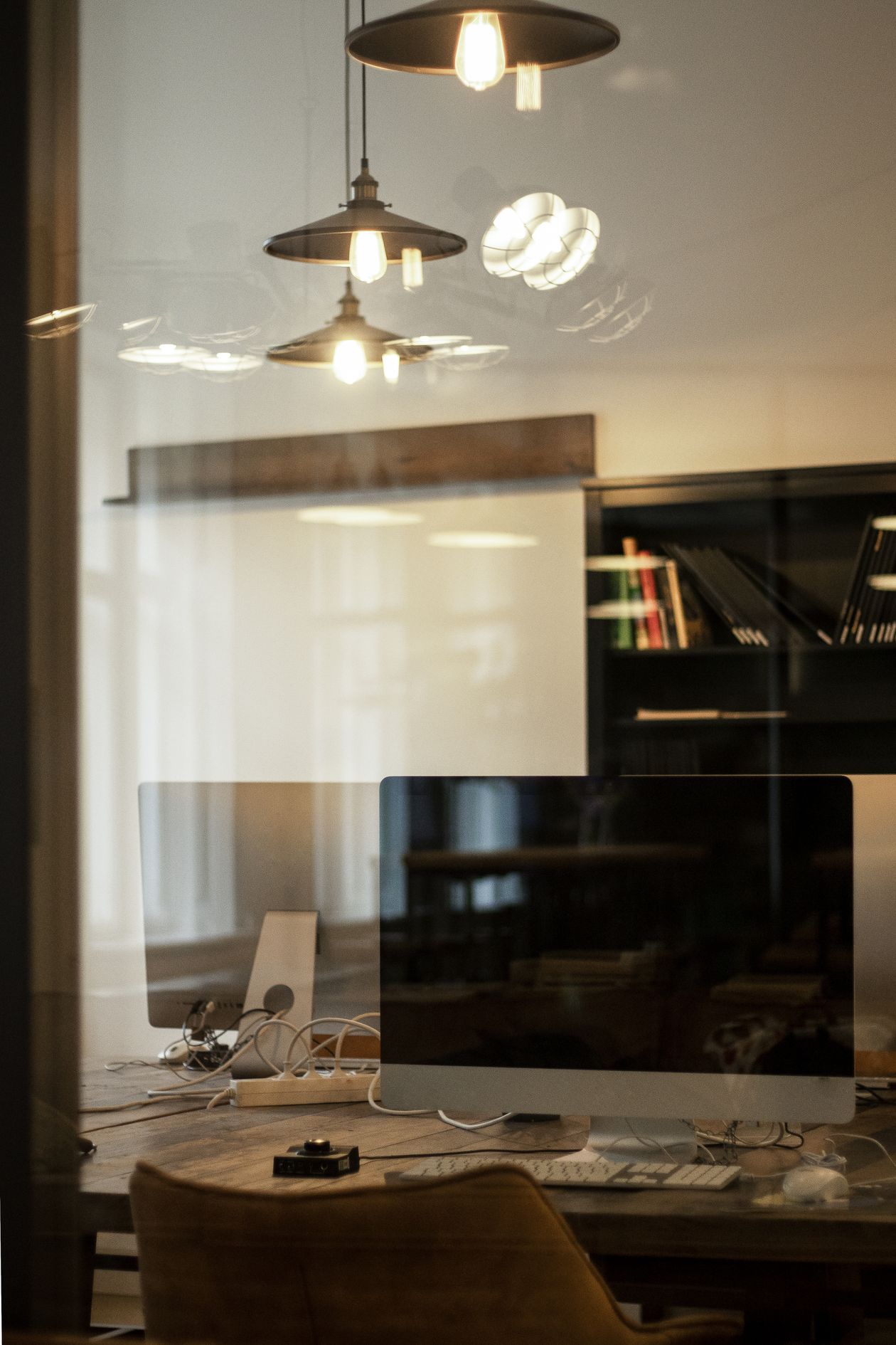
Home Office Color Ideas by Budget
Under $50: a single accent wall in a sample-size can. Around $200: a full room repaint in a calming neutral. Over $500: professional color consultation plus paint.
Home Office Color Ideas for Shared Spaces
In a multi-purpose room, a removable wall decal or a large framed piece in the target color can deliver a similar effect without a full repaint.
Frequently Asked Questions
Does color really affect focus and productivity? Research consistently links color to mood and arousal levels, which in turn affect how easily a person sustains attention on a task.
More Color Questions, Answered
What color should be avoided in a home office? Very bright, saturated reds and oranges tend to raise stress over long exposure and work better as small accents than dominant tones.
A Quick Color Checklist
Include: soft blues or greens, warm neutrals, and one restrained accent wall. Skip: bright red or orange as a primary color and painting every wall in a bold tone.
Home Office Colors for Natural Light Rooms
A room flooded with natural light can handle slightly deeper, more saturated home office colors without feeling closed in, since daylight balances out the added intensity.
North-facing rooms with cooler light often pair better with warmer tones to avoid feeling cold or sterile throughout a full workday.
The Bottom Line
The best home office colors lean toward calming blues and greens with warm neutrals, saving bold tones for a single accent rather than the whole room. Test a large swatch before committing to a full repaint. For more workspace ideas, see our Home Office guides and our furniture and decor picks. For color psychology research, Apartment Therapy is a helpful outside resource.